Initial Impressions: Shinola iPhone Leather Case
I'm a huge fan of the Apple leather case for the iPhone but it seems they only have a two year life cycle in them. Probably because most iPhone owners upgrade at least every two years. That's my own completely unscientific study by the way.
I just mention it because both my wife's phone and my own have had an Apple leather case on them and one of the corners (on both) have failed in a way that leaves the phone unprotected. And my iPhone now has a scar to prove it after a pretty decent drop.

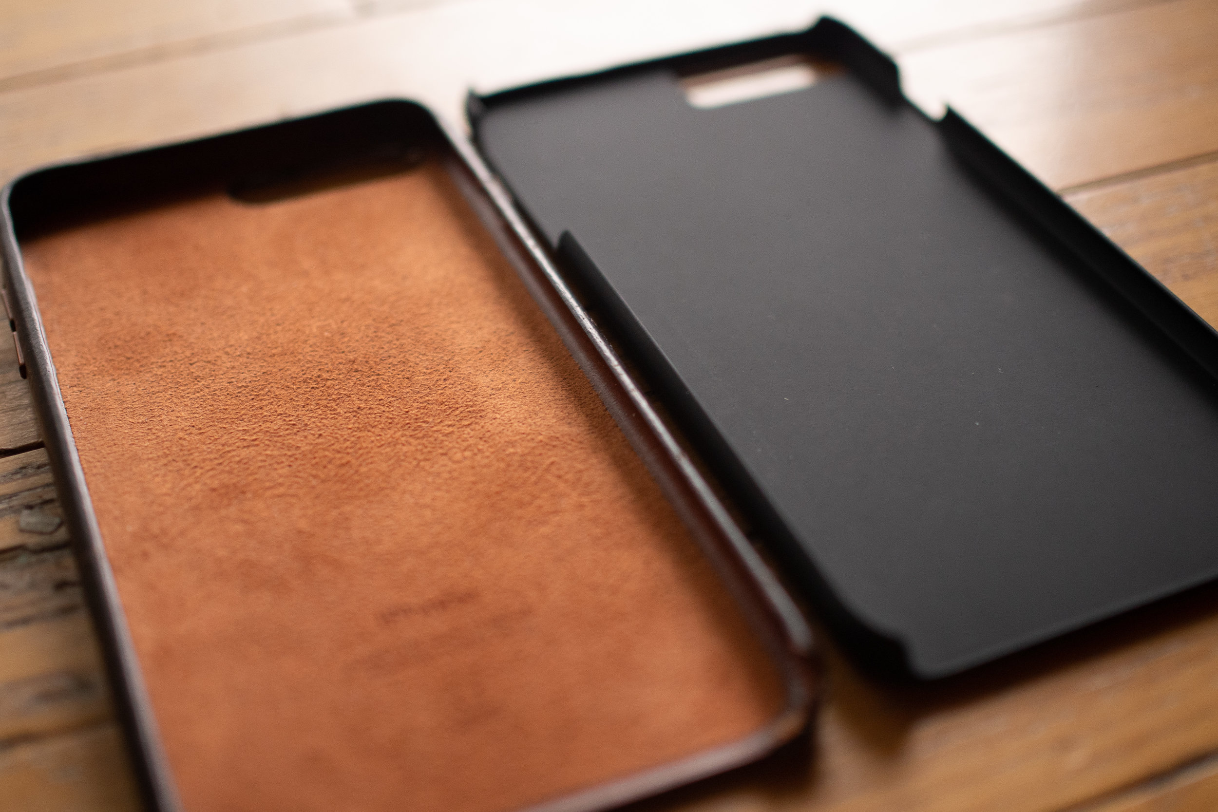
While on the hunt for a new case, I found one from Shinola that looked interesting and the coupon they recently sent me sealed the deal.
I ordered the case in Bourbon and straight out of the box I could tell how different it was from the Apple leather case that I'm used to. The Shinola case uses harness leather while the Apple leather case is made out of something much softer.
But let me first mention the packaging. Unboxing the case instantly made me want to order more from Shinola. Outstanding presentation.
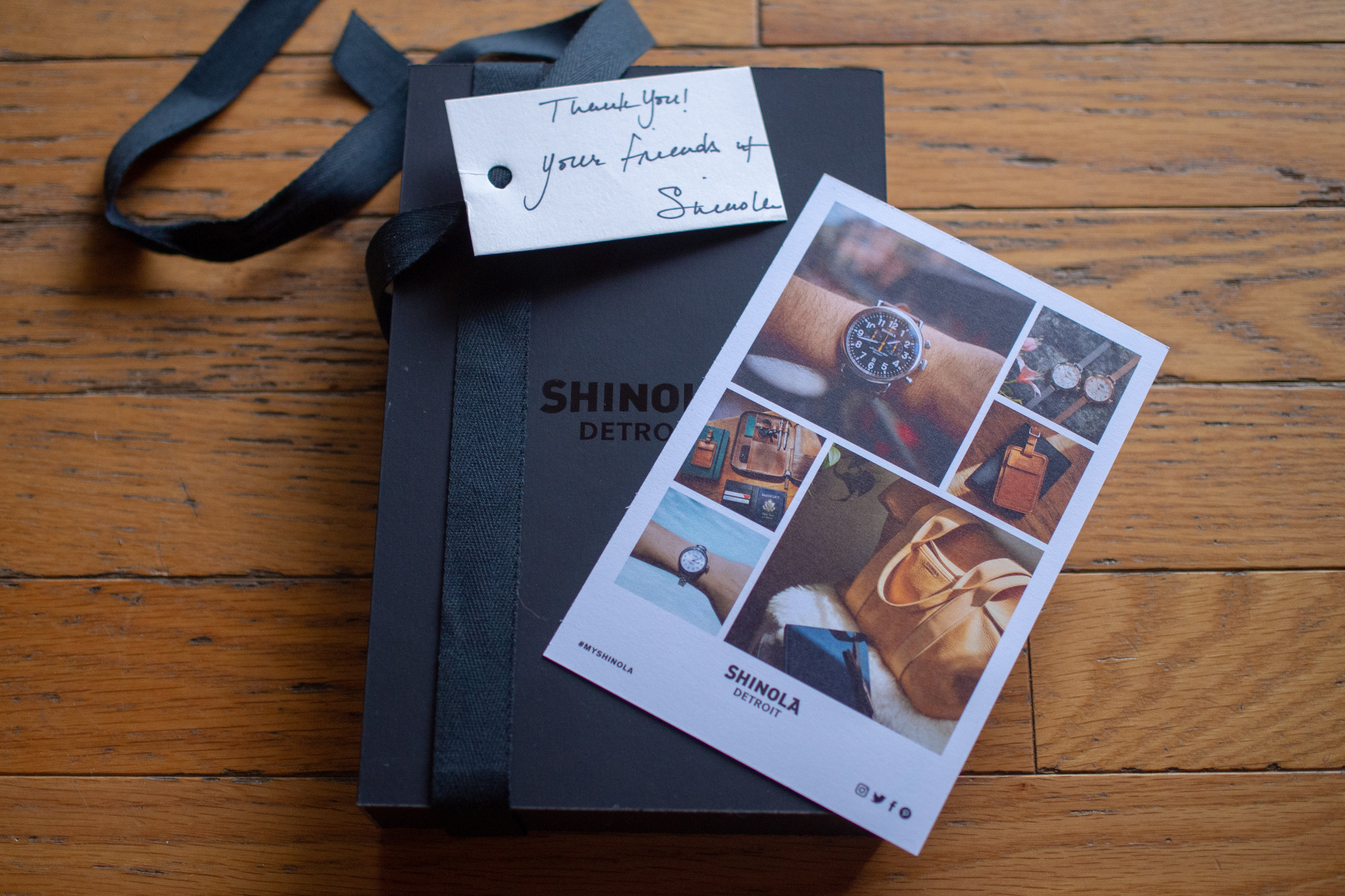

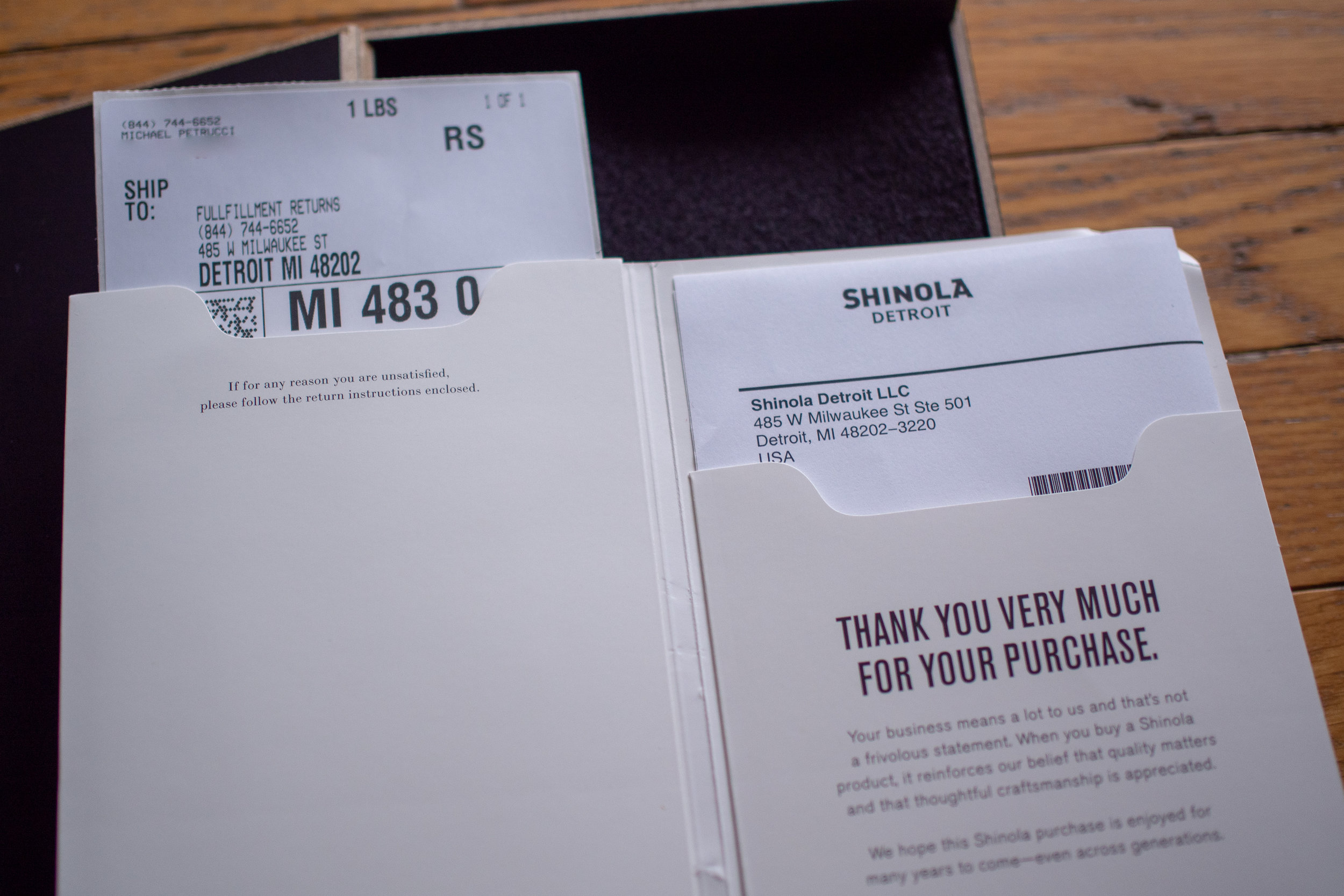
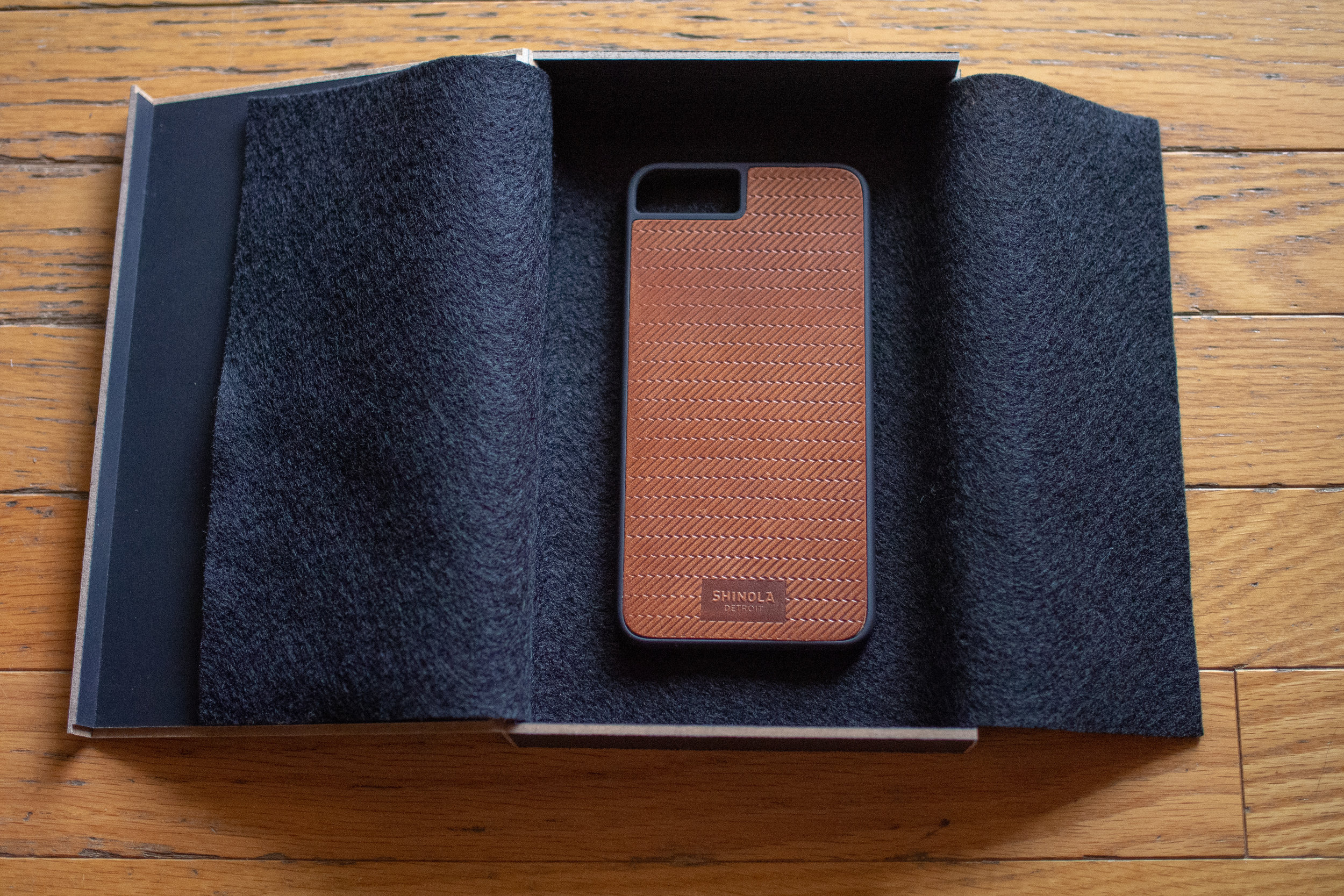
It is worth mentioning that I'm a Foundry member and I don’t know if that influences packaging.
Interesting Things to Note
There's no lip around the sides of the phone so you can't set the phone down without resting it on the screen. While I’m worried about scratches, the screens on these phones are generally built to be super tough. I also can’t deny how nice it feels to not feel that lip on the edge. We’ll see if it becomes an issue in the future.
The top and bottom of the case are cut in such a style that makes me feel as if they’re too exposed. I’m not sure if it’s purely a style choice or not but a case should first and foremost be fully functional as a case. These specific top and bottom cutouts leave some of the phone unprotected.
The rubber sides provide excellent grip. Much better than the Apple Leather case. Even for a Plus sized phone, it’s quite easy to hold in the hand.
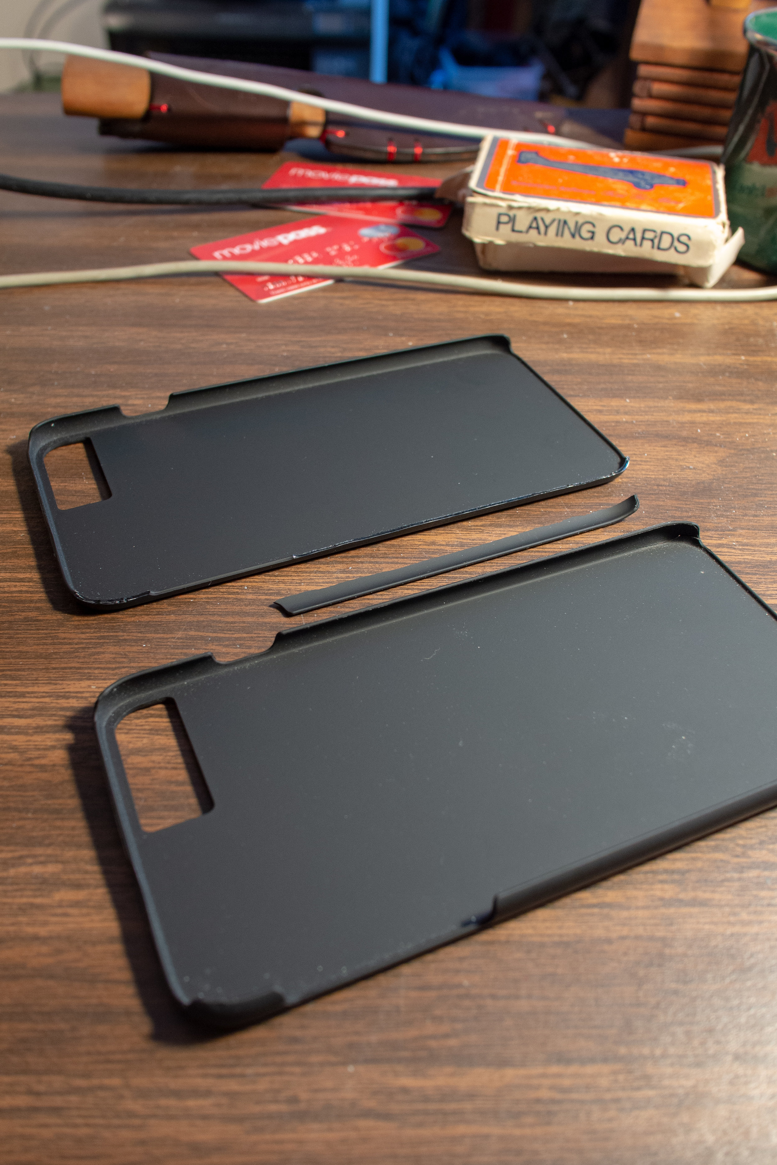
Overall I was happy with the case but just as I was going to post these initial thoughts, my phone took a few tumbles and the case is now cracked in three different places. This is very disappointing and I’m now back on the hunt for a new case. I also emailed Shinola about the cracks and I’m interested to see their response, especially since they say this about the case: “The minimal, sturdy design will protect your phone for years to come - or at least until you upgrade to the next iPhone.“ Well, for me, the case only lasted less than a month. It sounds like this will get sent back in the mail and I’ll dust off the old Apple Leather case until I find a replacement.

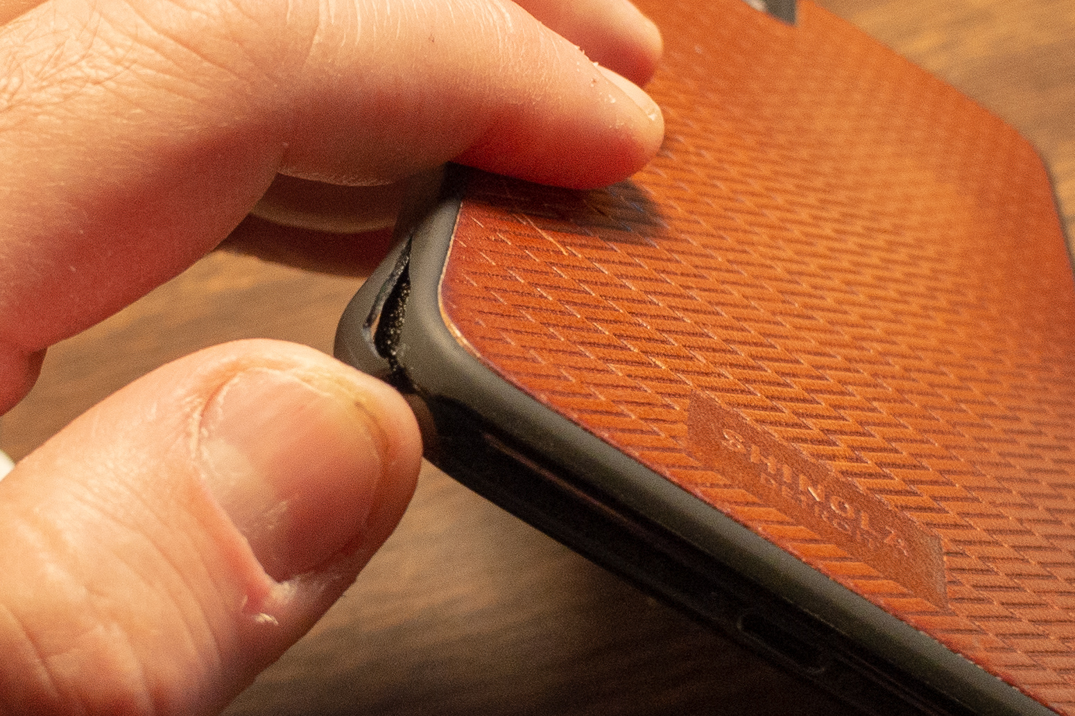
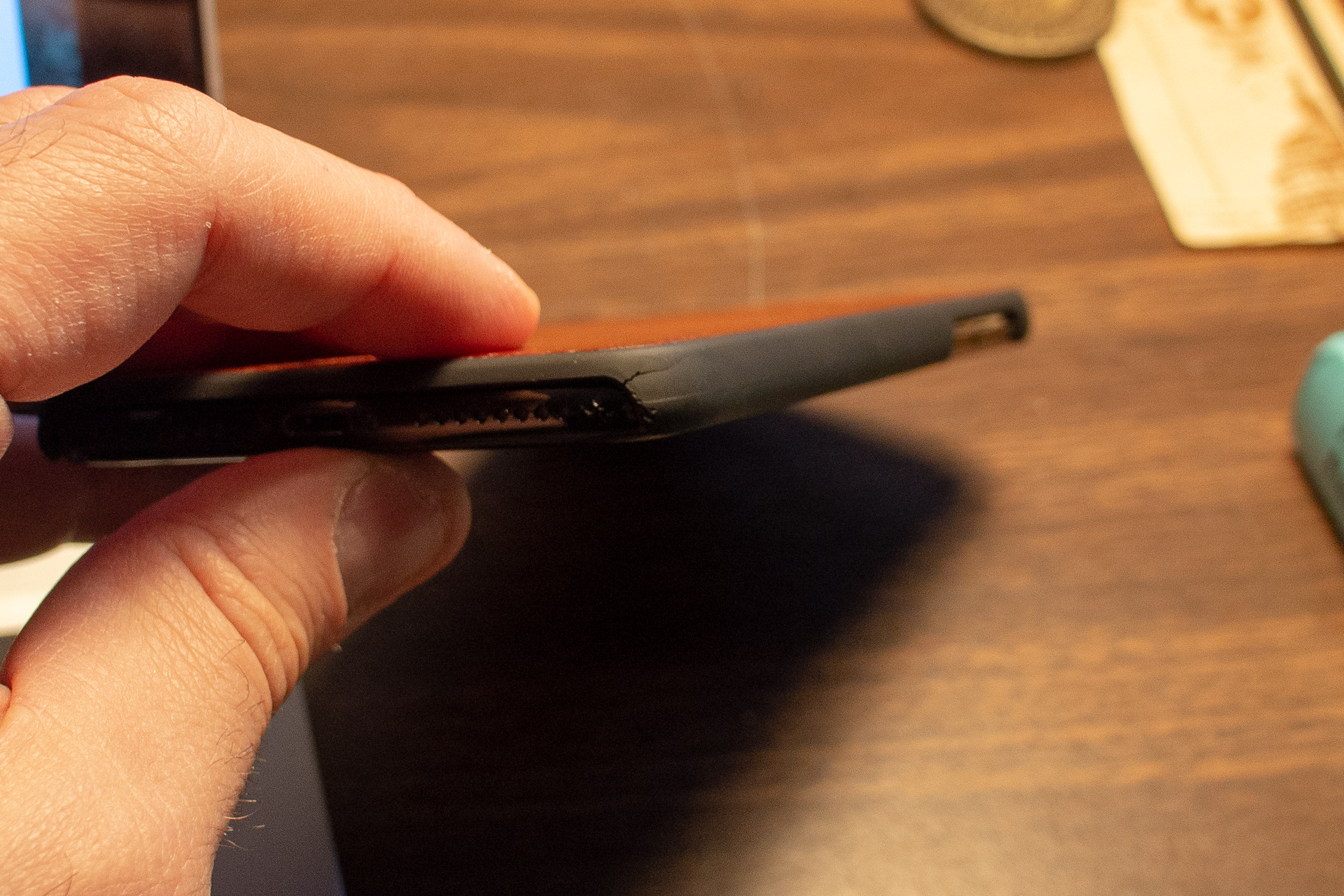
Update 01: Shinola sent a replacement case. So far so good! Though I haven’t dropped my phone yet.
Update 02: The phone took a 2-3 foot drop from my nightstand this morning and the replacement case is now completely unusable. I emailed Shinola again and hope to get a refund.


